The founders of the Obsesh Media Group approached Plaid Again in the Summer of 2020 to design their digital product with mobile-first thinking and to update their brand identity system.
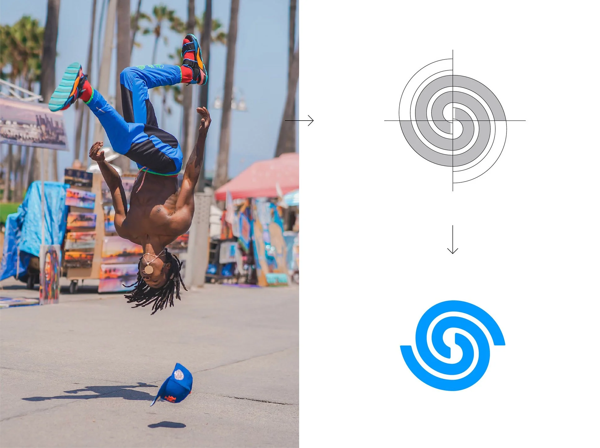
The redesign of the Obsesh logo mark started with the core of that Obsesh is all about, athletes getting better. For this to happen it takes practice and training, of which we translated visually as repetitive motion. The mark is designed to work at a small scale, which was needed as we got into the digital product design.
While selecting brand typefaces, we found faces that would work well for both marketing and product needs.
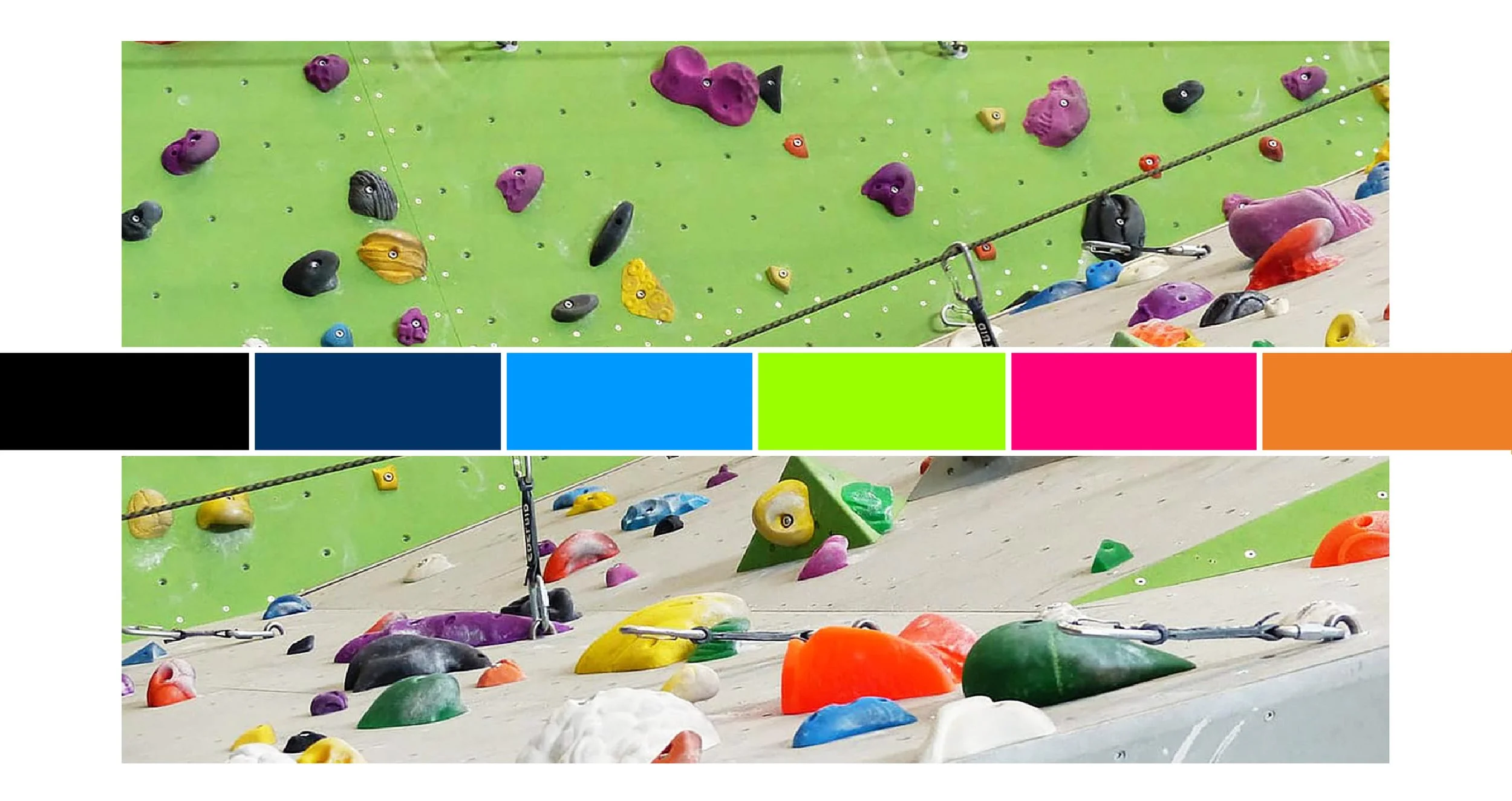
While selecting Obsesh’s color palette, we looked at different sports, fields of play, gear and equipment. We took into consideration the client’s product and marketing needs, and put together the above palette.
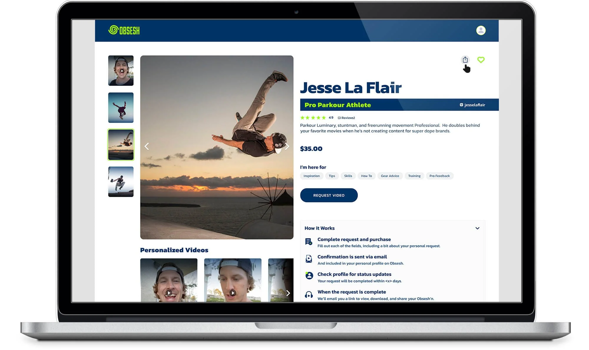
Obsesh’s digital product was designed with a mobile-first approach. On load of the home screen, the product dives directly into a search functionality for users to find their favorite sports and/or athletes.
As users navigate the product and find athletes they want to interact with they interact with, they are presented with a shopping-cart-like experience in which they are able to purchase personalized videos from an athlete giving them encouragement or even one-on-one advice.